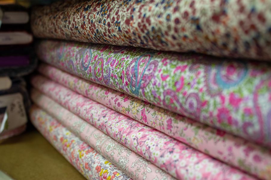
19 Nov Pattern Play – Mastering the Art of Mixing Prints in Upholstery Design
Upholstery design is a canvas where creativity thrives, and mixing prints can transform any space into a vibrant masterpiece. However, blending different patterns requires a delicate touch. The right combinations can create a dynamic, visually engaging atmosphere, while mismatched prints can lead to chaos.
The Power of Patterns
Patterns add life to any interior, sparking conversation and drawing the eye. They come in various forms—floral, geometric, striped, and abstract, to name a few. Here’s why patterns are essential:
- Visual Interest: Patterns break the monotony of solid colors, adding depth and dimension to a room.
- Personal Expression: Mixing prints allows you to showcase your personality and style, creating a unique space that feels truly yours.
- Harmony and Contrast: The right combination can harmonize disparate elements, or introduce thrilling contrasts that energize a space.
Guidelines for Mixing Prints
To navigate the exciting yet tricky terrain of mixed patterns, consider these fundamental principles:
- Stick to a Color Palette:
Begin with a cohesive color scheme. Choose a few colors that resonate throughout your selected prints. This common thread will tie everything together.
- Vary the Scale:
Combine different pattern scales for balance. Pair large, bold prints with smaller, subtler ones. For instance, a large floral can beautifully contrast with a fine-striped fabric, creating a pleasing visual rhythm.
- Consider Texture:
Texture plays a vital role in upholstery. Mixing textured fabrics, like a plush velvet with a crisp linen, adds another layer of depth to your design, enhancing the interplay of prints.
- Limit the Number of Patterns:
While the urge to go all out may be tempting, too many prints can overwhelm a space. Aim for two or three complementary patterns to maintain cohesion.
Creative Pairing Ideas
Here are some combinations that work well together:
- A classic pairing. Floral upholstery brings softness, while stripes add structure. This combination is especially effective in living rooms or bedrooms, where comfort meets style.
- Mix geometric patterns with more organic, flowing designs. For example, a geometric print on a chair can contrast nicely with a soft, botanical-patterned throw pillow.
- A bold plaid can serve as a statement piece when paired with solid upholstery. The solidity of a single color grounds the look while allowing the plaid to shine.
Conclusion
Mixing prints in upholstery design is an exhilarating journey that invites creativity and personal expression. By following the principles of color coordination, scale variation, and texture balance, you can create a harmonious space that reflects your unique style.
Remember, the world of patterns is vast—embrace the adventure and let your imagination run wild. The result? A beautifully curated environment that captivates and inspires!


