12 Jan How to Use Color Theory in Upholstery for Stunning Results?
Color isn’t just a visual element. It’s a language, a mood-setter, and a way to create harmony or excitement in a space. In upholstery, understanding color theory allows you to craft rooms that don’t just look good—they feel alive.
If you’ve ever wondered why some spaces feel balanced while others seem chaotic, the answer often lies in how colors are chosen and combined.
Start with the Basics – The Color Wheel
The color wheel is your best friend when it comes to creating dynamic and balanced spaces. It helps you understand the relationships between hues and opens the door to a range of possibilities:
- Complementary colors:
Opposites on the wheel, like blue and orange, create bold, energetic contrasts. They’re perfect for making a statement.
- Analogous colors:
Side-by-side hues, such as green and yellow, evoke harmony and are ideal for creating a relaxing atmosphere.
These combinations act as your palette’s backbone, ensuring every piece of upholstery you select fits seamlessly into the bigger picture.
Think About Mood and Function
Color doesn’t just affect how a room looks—it shapes how it feels. Choose hues based on the energy you want the space to radiate.
Warm tones like reds, oranges, and yellows bring energy and warmth, making them ideal for social spaces like living rooms. Cool tones like blues and greens offer calm and serenity, perfect for bedrooms or quiet nooks. Neutrals like beige, gray, or cream provide balance, acting as a canvas for more vibrant accents.
Balance Is Key
Too much bold color can overwhelm; too many neutrals can underwhelm. A well-balanced room lets one element shine while others support it. For example, a deep emerald green sofa can be the star in a room with soft cream walls and light wood furniture.
Consider scale and proportion, too. A large piece of furniture in a dominant color sets the tone for the room, while smaller accents like cushions or ottomans can tie in complementary hues without overpowering the space.
Experiment with Pattern and Texture
Color is just one part of the upholstery equation. Patterns and textures add depth, variety, and intrigue.
- Mix patterns carefully: Pair a bold floral with a subtle stripe or geometric print to create visual contrast.
- Add texture: Combine smooth fabrics like silk with rougher ones like linen or velvet to enhance tactile interest.
These details ensure your upholstery doesn’t just blend in—it becomes an experience.
Test, Adjust, and Play
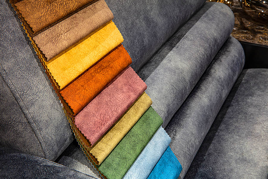
Before committing, always test your fabric swatches in the room itself. Natural light changes throughout the day, and artificial lighting can shift how colors appear. A rich navy might feel cozy in the evening but could come off as flat in harsh daylight.
Conclusion
Applying color theory in upholstery is more than a design trick—it’s a way to transform a space. It’s about creating places where people want to linger, rooms that tell stories, and designs that stand the test of time.
When you understand how color, pattern, and texture work together, you’re not just decorating—you’re curating an experience. With the right choices, your space will be nothing short of stunning.


